Modular Type Design
- carolinetilger
- Nov 5, 2020
- 2 min read

The modular typeface that I designed in Adobe Illustrator is based off of a two, 1/2-inch wide by three, 1/2-inch tall grid with a 1/10-inch gutter running through each of the grid sections. The modules consist of 1/2-inch by 1/2-inch squares, or other shapes that were created as a result of removing specific sections from the original square. In terms of variation within the "rules" of my grid structure and modular shapes, I allowed for some shapes to morph into others, which subsequently eliminated the gutter in between each module in that portion of the letter and expanded the shape to exceed the 1/2-inch by 1/2-inch square.

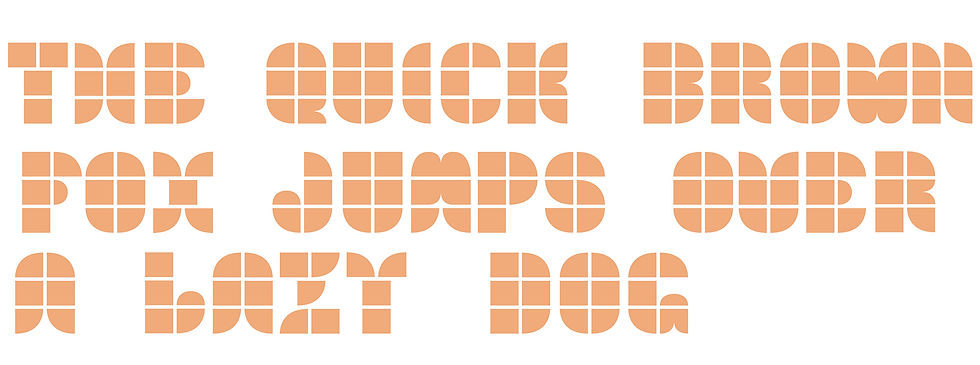
I would describe my modular typeface as geometric, retro, and both rectilinear and curvilinear. The capital letters are more vertically-oriented, which naturally makes the letters feel more linear and upright, while on the other hand, the lowercase letters seem more organic and curved, but also block-like. This typeface design would be best-suited for something along the lines of a 1970s vintage film or music festival poster, simply because of its geometric nature and its combination of hard and soft edges, which are all characteristics of design during this time period.
The Gestalt principles that are most important when it comes to interpreting my typeface design are closure, continuity, and proximity. Because the gutters separate each module, the letters are not fully joined, but because of the shapes' close proximity with one another and the continuity and closure understood while looking at each module grouping as a whole, the viewer is able to comprehend each grouping as a letter, rather than oddly-shaped orange blobs with white lines running through them.
Because of the initial grid I worked within to create each letter, taking into consideration factors such as cap height, ascenders, and descenders seemed fairly straightforward and ultimately worked within the grid. For capital letters, the cap height was three square high, while the lowercase X-height was two squares high. Both ascenders and descenders within the lowercase letters followed the same rule, which was to exceed one square above the cap height or below the baseline. The only letters that deviated from this rule were lowercase "i" and "j" because their "dots" extended all the way to meet the ascender line. In terms of weight, contrast, width, and posture, I would have to say that for the most part, both of my uppercase and lowercase alphabets consistently implement these principles from one letter to the next. Some letters, however, do seem wider than others, particularly within the lowercase alphabet, like lowercase "t" and "y" compared to letters like lowercase "o" or "c."


Comments